12.31.2006
12.07.2006
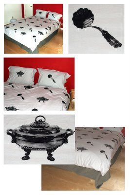
This was "the wedding gift" for two couples--
it was instigated by one request for "art", specifically screen-printing, but i thought it would be more meaningful to make something that gets used. and it's kind of a joke based on something one couple said in their registry:
"Facing obstacles typical of modern couples, we feel the best use of our wedding registry is to build a financial base that can be applied to a new home, graduate school and eventually a new family. We hope you will agree that paying off student loans, though less romantic than stemware, is a better investment than a soup tureen."
So it's kind of a joke about bad wedding gifts, but i thought that paired utensils sort of become analogues for the couple, and being placed in a bedroom setting a sexual analogy in "serving soup".

11.20.2006
11.13.2006
11.09.2006
11.03.2006
10.12.2006
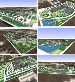
"this is what I have been working on (or trying to). my old hospital project is in construction, and I seem to be devoting 90 percent of my time in Constr. Admin. Not a lot of time to do design for this latest project in Iowa (see attached). It is a Wellness Campus consisted of Medical Office Buildings (MOB's) and a Wellness Center which is essentially an athletic club. I'm on the Wellness Center, which is the building that seems to be all by itself next to the other three).
I tried posting on the blog but I forgot how. I was getting impatient, so I'm doing it the old fashioned way (the only way my old ass knows how)."
---from kirk
10.06.2006
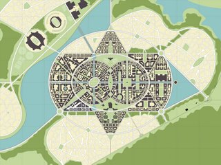
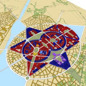
So here are some more iamges of what I've been slaving away on. These are just the univeristy piece, the stuff below is the whole 8,000 acre site. For a scale that is like a couple dozen Savannahs. And I'll try and describe the design intent a little bit, but it would prboably take a few hours to get it all out. So until then....Formally, the scheme is based on the Indian Mandala, extremely geometric, with multiple levels of distintcly different order. The growth pattern is model after the blooming of a flower, also a very powerful thing in Indiam cultural. The town, indicated in block form, is so organic in nature because the land is increbly flat and our initial idea on how to bring this down to a pedestrin scale is to take cues from German and like minded patterns that restrict sights lines and spaces when topogrpahy is not able to do so. But then I started thinking, Savannah is extremly flat, it has an orthognal grid. But it has short sightlines and defined spaces, some might argue that its because it is only a mile wide, but I really think its the trees. They really keep the scale down!
9.25.2006
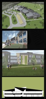
i'm working on the same school.
here are a couple of sketchup/photoshop renderings and a quickly color filled bldg section.
right now wall sections/details and building sections.
the roof got a little more complicated but still very simple, with clerestory windows occurring in the vertical surfaces created by the folding of the roof--creating alternating north and south lights into the group learning spaces and corridors, respectively. the deep v in the section was an attempt to separate the north light (group learning space) from the south light (corridor) by a sort of "light threshold".
9.21.2006
Subscribe to:
Posts (Atom)