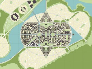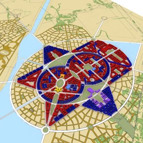

So here are some more iamges of what I've been slaving away on. These are just the univeristy piece, the stuff below is the whole 8,000 acre site. For a scale that is like a couple dozen Savannahs. And I'll try and describe the design intent a little bit, but it would prboably take a few hours to get it all out. So until then....Formally, the scheme is based on the Indian Mandala, extremely geometric, with multiple levels of distintcly different order. The growth pattern is model after the blooming of a flower, also a very powerful thing in Indiam cultural. The town, indicated in block form, is so organic in nature because the land is increbly flat and our initial idea on how to bring this down to a pedestrin scale is to take cues from German and like minded patterns that restrict sights lines and spaces when topogrpahy is not able to do so. But then I started thinking, Savannah is extremly flat, it has an orthognal grid. But it has short sightlines and defined spaces, some might argue that its because it is only a mile wide, but I really think its the trees. They really keep the scale down!
1 comment:
it seems like an awesome oppurtunity to work on something that big.
Why so much emphasis on sight lines for making something function at a pedestrian scale? in describing how savannah works,or any other pedestrian friendly environment, sight lines would not come to mind--especially not as a cause, but perhaps as a consequence.
is it an issue of "looking like vs. functioning as"?
awesome to have others posting work,
and it was great this weekend to catch up with some other alum's on what they were doing. really useful to help put things in perspective.
Post a Comment