11.05.2007


Failed graphic.
"the shaved head is the new mustache of law enforcement".
Originally this started as a joke about how all cops now shave their heads.
and it was originally going to be sort of a homoerotic cop on cop locker room shaving incident, but when two dudes are in underwear how do you tell they are cops.
it then turned into the next image.
I have no excuse for the carribean/african colors.
I like the idea of defining an identity by all of the facial trappings, I would be interested in reusing it divorced from the dumb cop joke.
like aviators/beards/mustaches and plastic framed glasses--all of my accoutrements.


10.31.2007

Pretty awesome...


Maybe I am behind the times, but my mom told me to check these out... there are some more dynamic ones on Youtube.

10.23.2007

I have avoided posting links to other websites as content,
but I don't think it really matters at this point--and I feel compelled to tell as many people as possible about a couple of my favorite things on the internet.

1] blogoteque take-away shows
When touring artists come through Paris they are convinced to film these performances in unusual and impromptu venues; filmed(in a fantastic widescreen format). The quality is great. but the performances are often overwhelmingly optimistic. Check out the liars crack themselves up, improvising drum parts off of the different sides of an elevator.

2] Daytrotter Sessions
As bands pass through the midwest they stop and record special sessions that are then released as free mp3s; great bands, and at this point a huge archive of past sessions.
vampire weekend just posted.

3] catbird records
This record label releases small runs of a couple hundred cds, at ridiculously low prices--often on gocco printed sleeves. And the releases are all great. Tap Tap, Forest Fire, Pet Politics, and The Ghosts are some of my favorites. They also have a great music blog at catbird seat.

10.05.2007


Just in case anyone out there is looking for a job, I found this interesting bit of advice on portfolios.

9.28.2007


Got a questionaroni. It has to do with internet bookmarks. Specifically the taxonomy of said bookmarks. They are spiralling out of control for me. I have found a plug in I like (Foxmarks for Firefox) and now I need to organize. I would love if there existed a convention for this. Sounds like there should be an iso protocol. As there is not one that I'm aware of, and I don't see how the Dewey Decimal system helps me, I'm asking for your help. Does anyone have a good system that they have developed? Or know of a resource? Now that I'm thinking about it more, maybe the DD would work. Seems like I'd have all of mine stashed in the 700's.

9.23.2007


hill house by eero saarinen. fenestration pattern, brick wall radiused to meet the ground plane, and over-fired bricks.


I got a little excited to see this Robert Indiana sculpture in person, as i had only seen it in pictures (even though it's something I was never particularly interested in)--and my instinct was to commemorate the experience by taking a picture of it. enjoy.

9.17.2007


cardboard partition wall blocking off an unused portion of the building housing the exhibit.


my favorite piece from the Broadcast show at the Contemporary in Baltimore.

9.13.2007


I'm doing a lot of work like these two projects lately--relatively quick sketchup models photoshopped.

9.05.2007


You probably haven't seen stacks of trees like this since "Method & Red" got cancelled.

8.30.2007

i came across this image in a baltimore market advertising some sketchy weight loss pill--and thought it would be fun to work on a similar series of silhouettes of myself:


then while researching fat bodies to help me out i came across this diagram of the "regressive male"--and it put mine to shame. its so simply done graphically.

8.13.2007

Did anyone else read the article about clearview a few weeks ago? It's the new typeface developed (and Federally approved) to take the place of highway gothic on all highway signs. I had never previously given much thought to the typeface on highway signs, but the difference in readability is pretty clear. The designers of Clearview had to come up with a typeface that was readable with only a quick glance and that would remain legible during halation, or the blurring that occurs when bright lights (such as headlights) hit reflective type.

8.12.2007


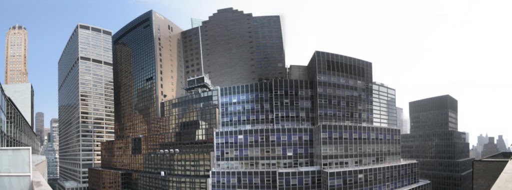
The first image is the view from the balcony that all you suckers missed by not staying with us in our sweet sweet Midtown hotel. Second photo is what I assumed to be the loading dock structure built for the delivery of the steel pieces. Third needs no explanation.
More Serra pics here.

Its hard to capture the big pieces with a point and shoot and tons of people around. You need distance from the object and a nice wide lens to take it in. The earlier works were great, but no photos are allowed to be taken inside the MOMA. Also, those works are best absorbed in discussion. They don't impact the viewer in such a visceral manner as the Torqued Ellipse and the like. We're still awaiting the exhibition catalog and I think only when revisiting those early works will I begin to understand those hung belts and draped rubber pieces. I've been reading his interviews book and its illuminating. Before the rest of you go, make sure to watch this. I saw it about a two months ago and its great stuff. Still can't prepare you for the experience of walking through his new pieces on the second floor. Awe-inspiring.

Longchamp pics here.